Ready to create a custom launcher that matches your style? This guide will walk you through setting up the Editor, understanding its interface, and making basic customizations like swapping images, changing fonts, and more.
Why the Editor Matters
The Editor is a powerful tool that lets you design and personalize themes for your launcher. Whether you’re updating visuals, adjusting layouts, or adding interactive elements, the Editor gives you the flexibility to bring your vision to life.
First-Time Setup
The easiest way to get started is by creating a theme through the Patchkit Panel and opening it in the Editor.
-
Create a Theme:
In the Patchkit Panel, create a new theme.
-
Open in the Editor:
Once the theme is created, open it directly in the Editor.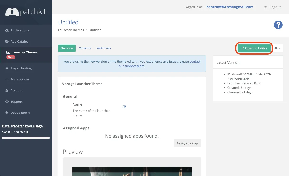
When you first launch the Editor, a default theme will load. Feel free to modify it—replace images, change fonts and colors, and explore the possibilities!
Navigating the Editor Interface
Understanding the Editor’s layout will help you work more efficiently.
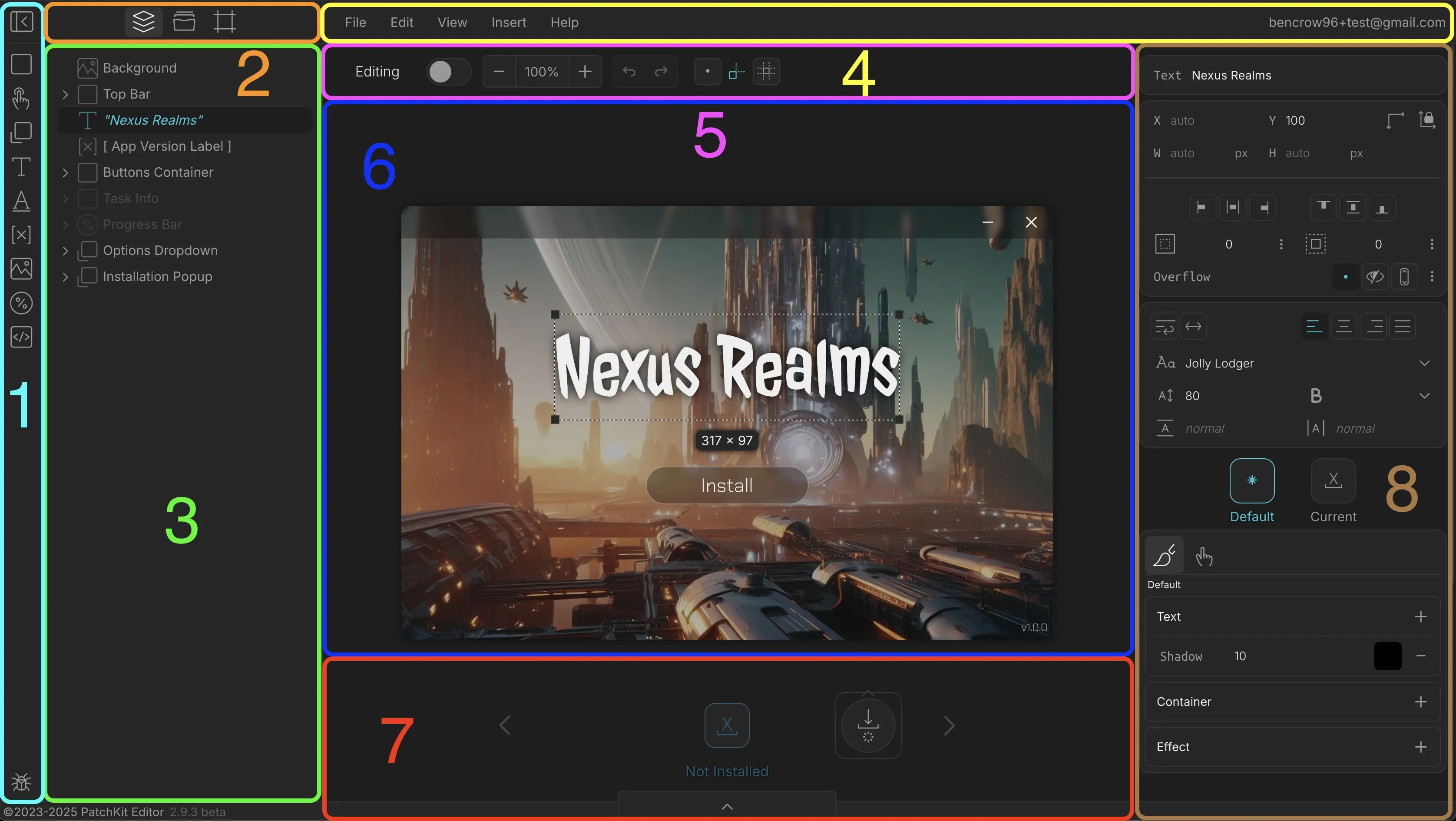
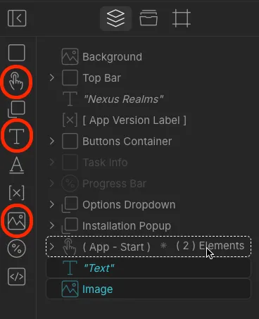
- Toolbar: Collapse the Sidebar, add new elements, or provide feedback.
- Sidebar Tabs: Switch between the Element Tree, Assets, and Window views.
- Element Tree: See all elements and how they relate to each other.
- Top Bar: Access the main menu and view your logged-in account.
- Scene Bar: Toggle between Editing and Simulation modes, zoom in/out, undo/redo, and set snapping options.
- Scene: This is your workspace where you interact with elements.
- View Controller: Manage views and element visibility.
- Element Properties: Adjust properties and styles of selected elements.
Editing vs. Simulation Mode
The Editor has two primary modes:
- Editing Mode: Customize and arrange elements.
- Simulation Mode: Test how your launcher will behave for users.
Switch between these modes to smoothly design and test your launcher.
Basic Customization
Let’s explore some simple ways to customize your theme.
1. Swapping Images
Step 1: Upload your image to Assets.
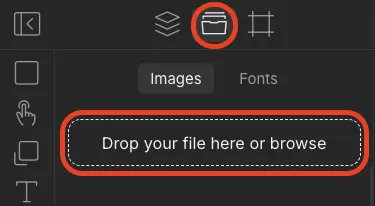
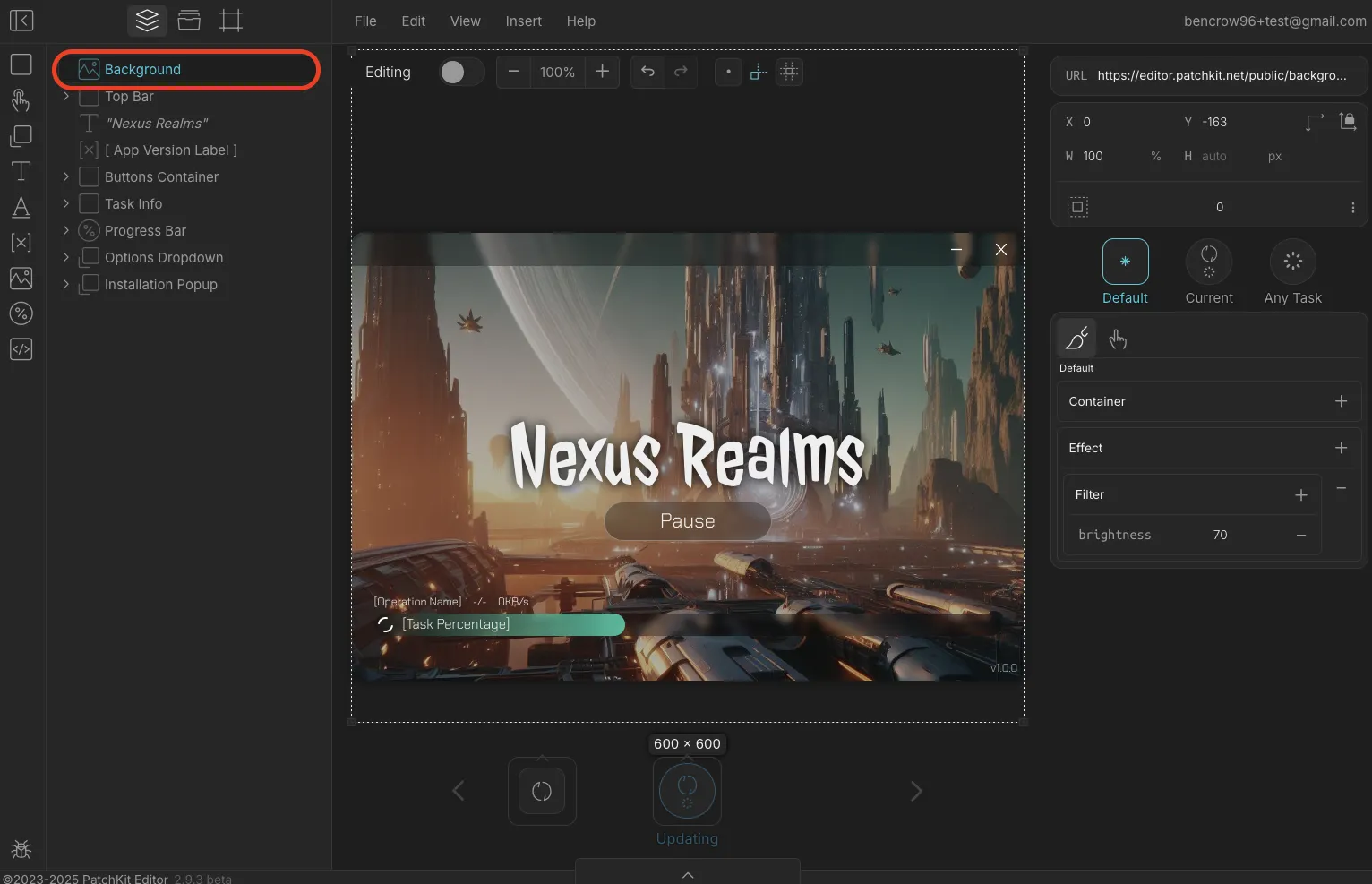
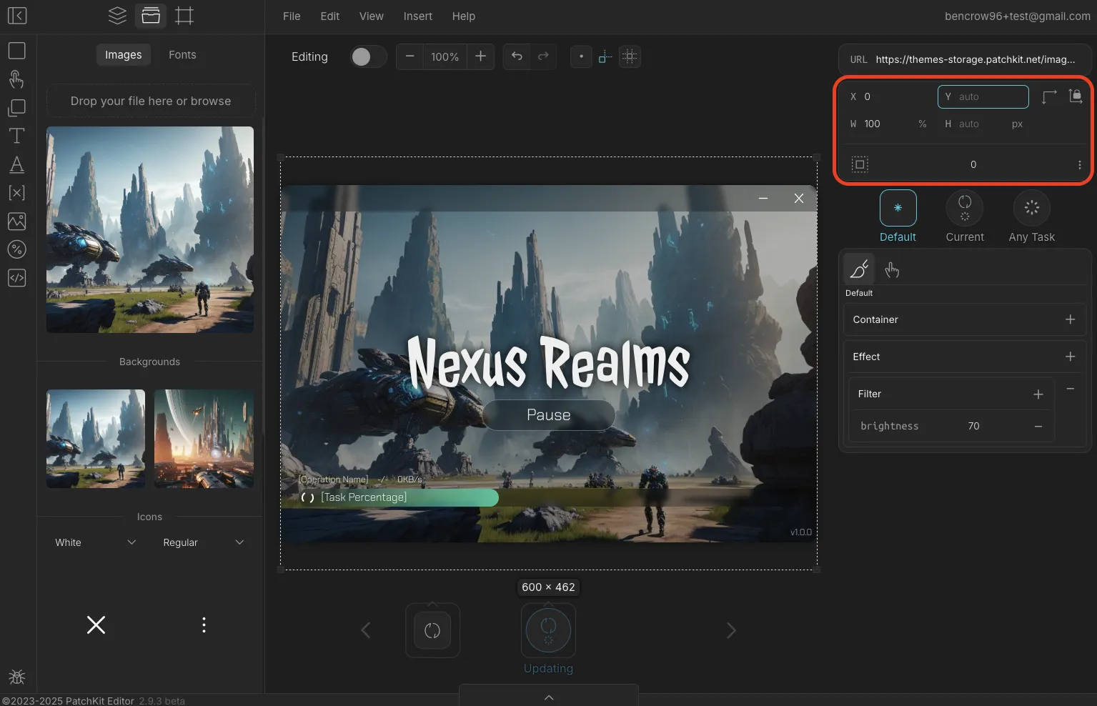
Step 2: Select the image you want to replace—either on the Scene or via the Element Tree.
Step 3: Click your uploaded image in Assets. If the image element is selected, it will be swapped. Otherwise, a new image element will be added.
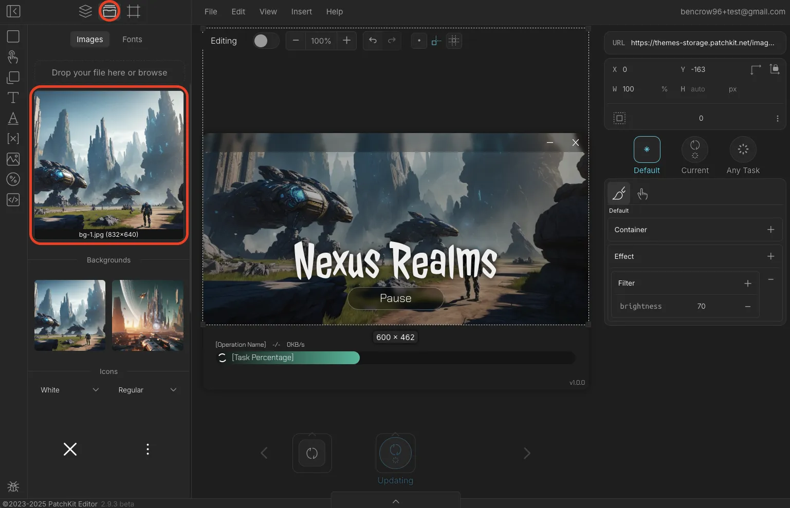
Tip: If the new image has different dimensions, adjust its position. Deleting position values will let the parent (the launcher window) automatically center it.
2. Changing the Font
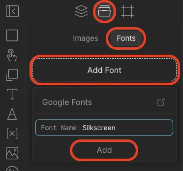
Want to refresh the text style? Add custom fonts through Google Fonts.
Step 1: Go to Assets → Fonts → Add Font and type in the font name.
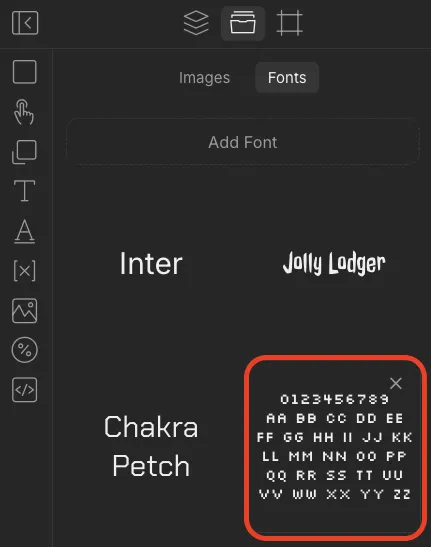
Step 2: The new font will appear in the list. Hover over it to preview.
Tip: Remove unused fonts to improve launcher loading times.
Step 3: Select the text to edit, then apply the new font from the properties panel.
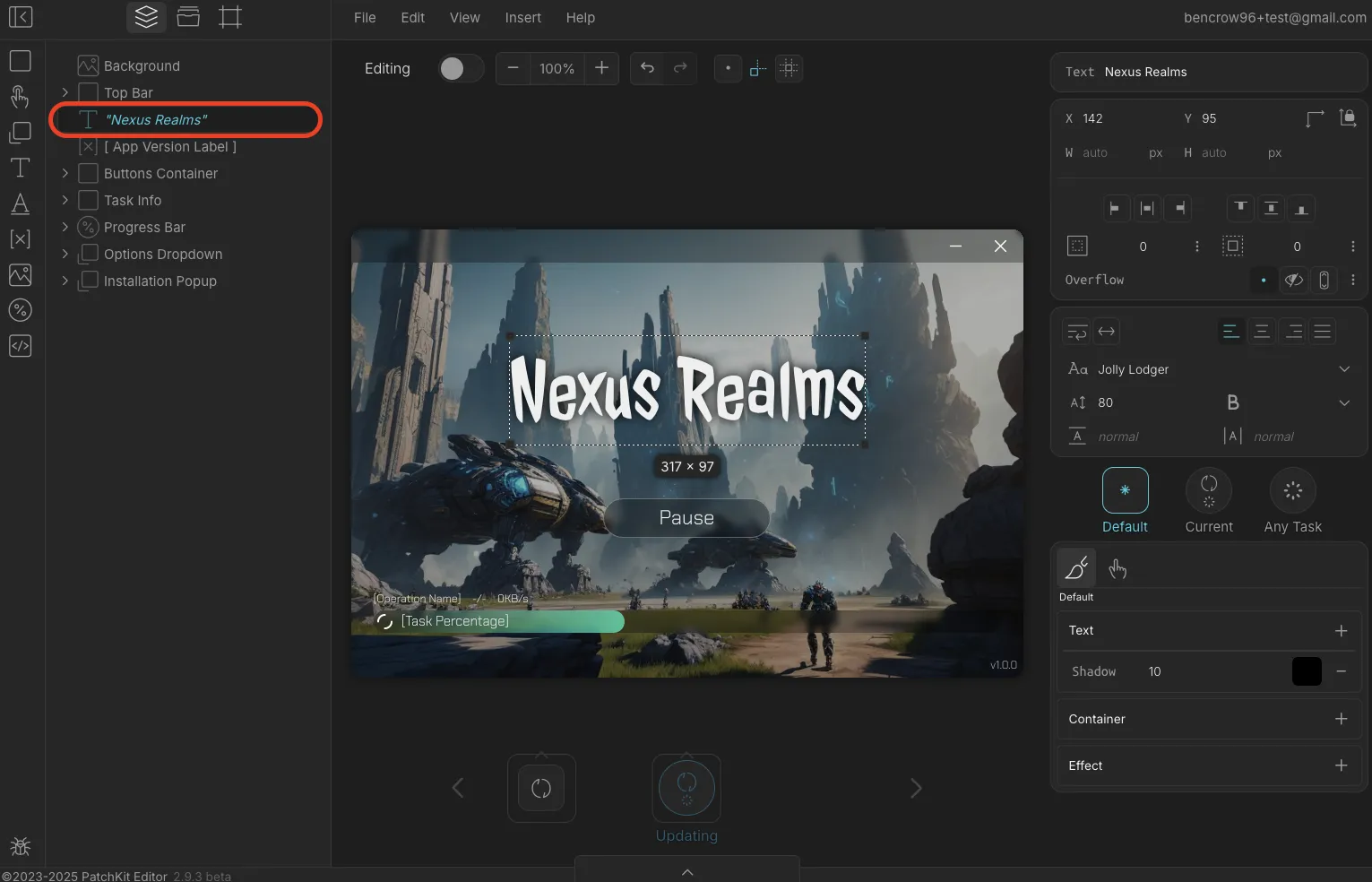
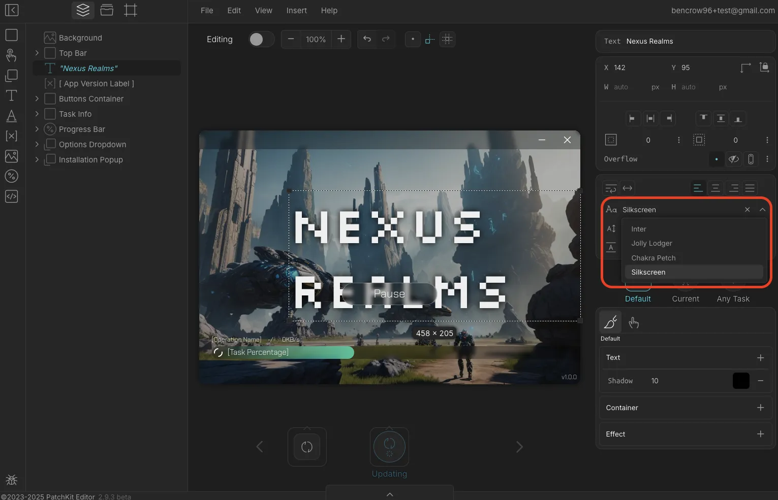
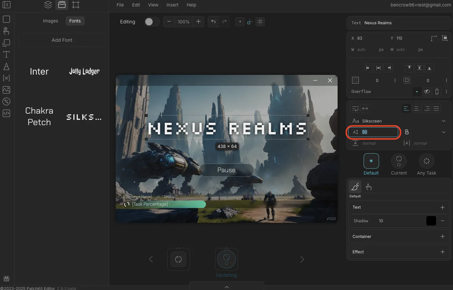
Note: Font sizes vary, so you may need to adjust the size for the best fit.

3. Editing Text
You can change the text content directly:
- Double-click the text in the Scene, or
- Use the Text input field in the Element Properties.
4. Changing Colors and Styles
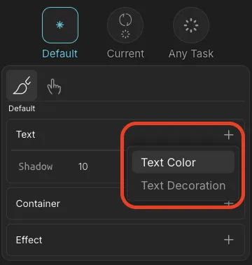
Customize text color, background color, and more using the Style Panel.
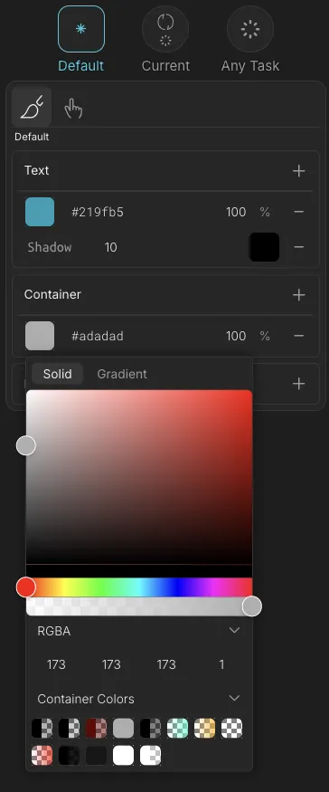
⚠️ Important: Styles can apply to either the Default state or a specific launcher state.
- Dimmed state: Editing the default style.
- Highlighted state: Editing the style for the selected state.
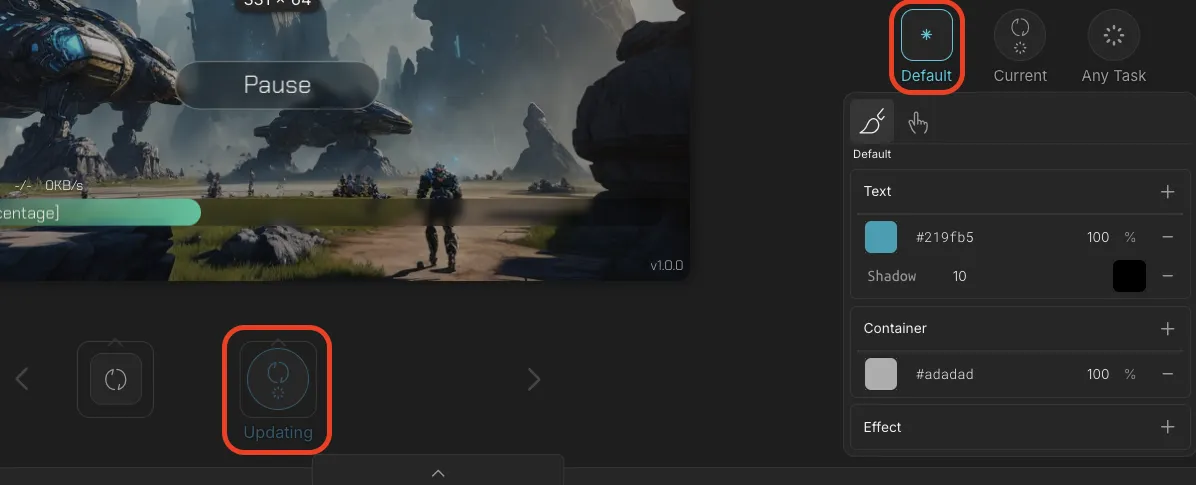
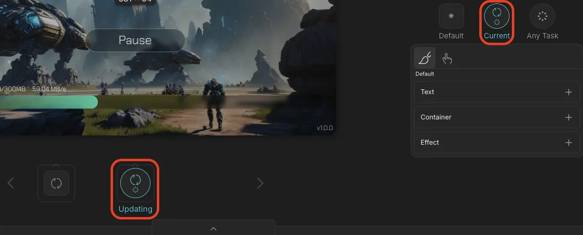
For beginners, we recommend editing only the Default style to avoid confusion.
Saving and Publishing Your Theme
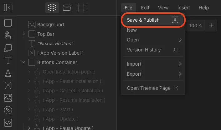
Saving your theme automatically publishes it—updating your launcher instantly.
To Save & Publish:
Go to File → Save & Publish.
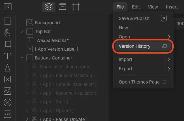
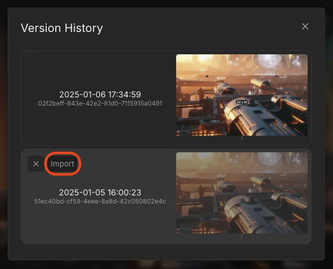
Restoring a Previous Version:
- Go to File → Version History.
- Import a previous version and save it again.
Final Thoughts
Congratulations! You’ve learned how to:
- Set up and navigate the Editor.
- Swap images and adjust positioning.
- Add and apply custom fonts.
- Edit text and styles.
- Save and publish your theme.
Now it’s your turn—jump in and start creating a launcher that stands out!
🎨 Ready to design? Open the Editor and start customizing today!
